skinflint meets: Cambridge Imprint
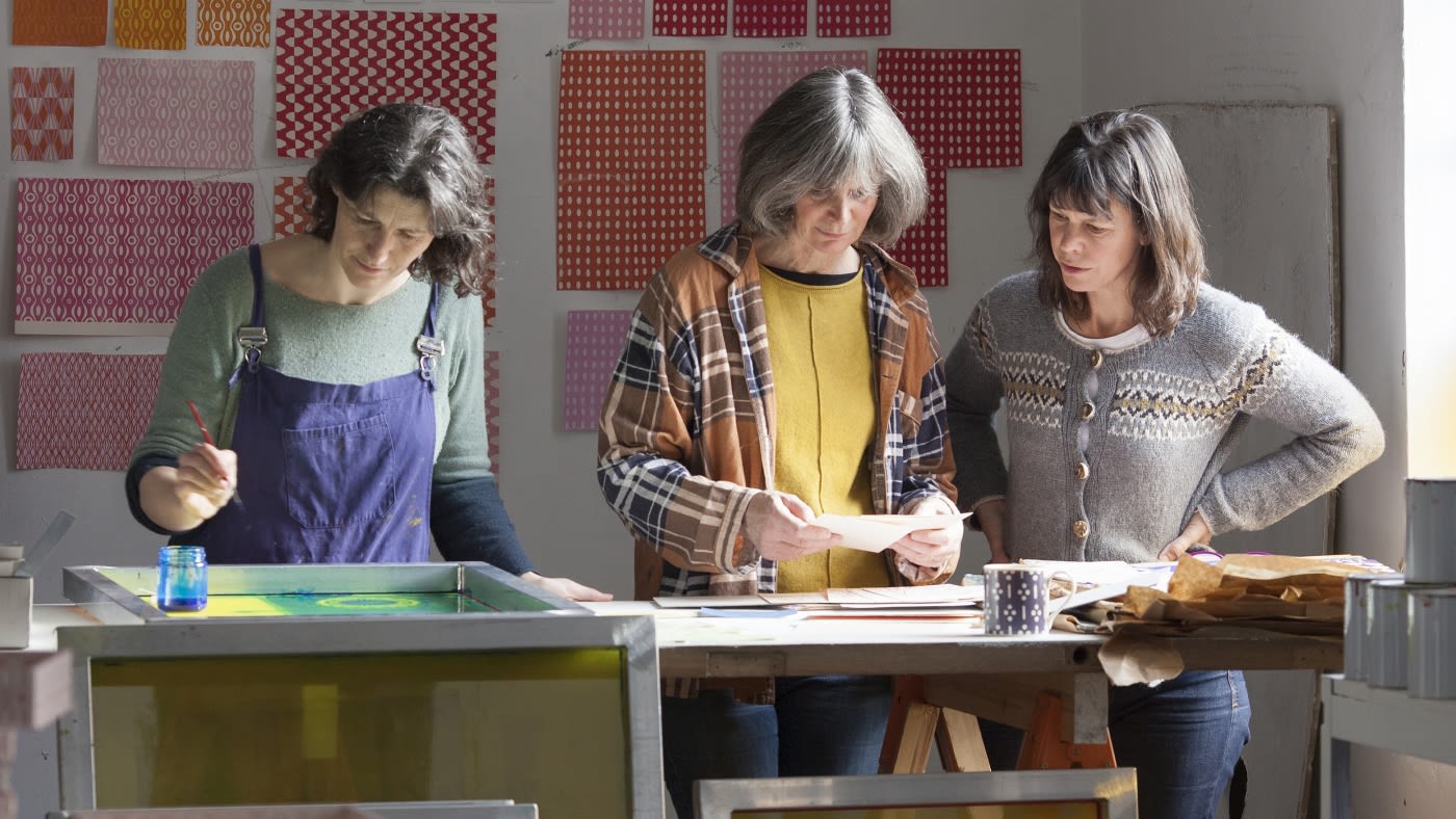
In our latest series of skinflint Meets, we caught up with Claerwen James, Ali Murphy and Jane Powell – the faces behind Cambridge Imprint and chatted all things design, inspiration, how to create successful collaborations, and more.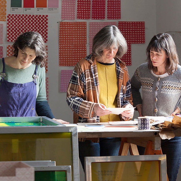 skinflint: Why and how did you start Cambridge Imprint?
CJ: We all enjoy making things — not just in our art practice, but domestically. Cushions, tiles, cards, decorated furniture, prints. We would often find that we were making things for each other because our tastes are so coincident. And scavenging at car boot sales and flea markets, we would find that we were excited by the same objects.
AM: And they were often patterned objects: a Baron and Larcher block printed textile, an antique American quilt, a scrap of Japanese paper, a pink lustre pot. We all love browsing in auctions and junk shops but if we’re together it’s like a competitive sport, inevitably we will always make a beeline for the same object.
CJ: Also the fact that we had rather different expertise was exciting – for example, that I might find, say, a particularly pleasing patterned mug in a junk shop and Ali would know what the glaze was, the date and the method of applying the pattern. And over time this grew into a feeling that we should really do something together on a more ambitious scale. I think we all felt that it would be good to allow ourselves to make things that were unashamedly decorative, without the weight of anxiety that an art practice is sometimes fraught with. We didn’t want to create pastiche but we were happy to absorb and reflect influences. We also wanted to make things that were useful. And we were interested in using industrial methods to the extent that was possible. So out of this rather amorphous set of desires, Cambridge Imprint was born.
AM: At the outset that was really the full extent of business plan! We started experimenting about five years ago, and we began trading in earnest three and a half years ago.
skinflint: You each have other disciplines outside Cambridge Imprint; how does this influence the work you do together for the various patterns and collections?
JP: The great thing about coming from different disciplines is the broad pool of ideas at our fingertips.
CJ: Yes, it’s useful to be able to draw on different expertise (Ali is a ceramicist, Jane is a textile artist and Claerwen is a painter and printmaker) both in terms of different mark making traditions in different media, and also when it comes to thinking about the medium that a design might be carried by.
 skinflint: What made you decide to work with paper?
CJ: There is a simplicity and honesty about paper that is appealing. We tend to create the original designs by screen-printing onto paper, so the process of designing is straightforwardly generating the prototype—there is no further leap of imagination required to translate the design onto another medium. So when looking for a printer to collaborate with, we could say—look, we want to print paper that looks and feels exactly like this. And happily we did find such a printer who was sufficiently interested and patient to let us get really involved in the printing and colour matching, and explore what the possibilities might be. That relationship is absolutely crucial.
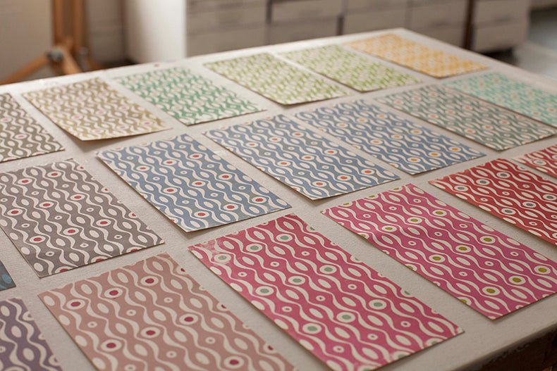
There is this seductive but dangerous possibility now—you can use digital printing to produce an almost perfect simulacrum of something that has been hand-printed. But basically it is a photograph. We wanted instead to go back to an earlier, more honest, industrial process that mirrors the process of hand-printing. So we use a litho press and print in spot colours. Where you see mustard yellow, for example – that is created by printing a plate in a mustard yellow ink that has been hand-mixed for that purpose, not by building up the colour with varying density of dots in a four colour digital process. The clarity of the colour is incomparable. Also, it means that we are restricted to an absolute maximum of four colours in any design (plus any secondary colours generated when two of those colours are printed on top of one another) and this puts severe limits on the complexity of the designs we can create which is, paradoxically, a real spur to the creative process.
JP: Then, once we were making the paper we discovered that we had been rather lucky – that there was a bit of a gap in the market. And, also, although we are lovers of stationery ourselves, we had not quite appreciated that it’s such a widespread enthusiasm. So we slightly stumbled into this nice niche in the market.
skinflint: Alongside your paper products, you produce beautiful tea towels. Are there any plans for a fabric collection or even wallpaper?
AM: Translating our patterns into fabric feels like the natural next step for Cambridge Imprint after paper. But we are a small team, so the number of hours in the day limits how fast we can expand. We’ve been experimenting with printing onto linen in the studio and we’ve found a printer we would like to work with in the UK. Wallpaper feels like more of a departure, but something we regularly discuss.
 skinflint: How do you design new patterns? Is it collaborative between the three of you, or do you each design patterns and show the others?
JP: We each tend to develop our own patterns but we definitely influence one another as we bounce ideas off each other along the way.
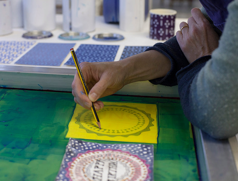
CJ: We use extremely simple equipment to design new patterns: paper, pencil, scissors. We occasionally use a very ancient black-and-white photocopier to try out the effect of a scale change or to generate some repeats. Once we have a pattern that looks promising we’ll hand draw it onto a silkscreen and create a stencil. Then we mix and trial colours by hand. So the entire prototype is created in the real world - the dead hand of the computer doesn’t come into it.
We all generate designs independently and then ask for feedback from each other when the design is more or less finished. We generate a lot of material between us and it’s usually a question of editing the possibilities down to a collection that hangs together. Some good stuff gets left on the cutting room floor.
skinflint: Your recent collaboration with Grenson Shoes was well received. Where did the idea to put one of your patterns on a pair of shoes come from, and are there any other collaborations in the pipeline?
CJ: Grenson Shoes and Persephone Books are neighbours in Lamb’s Conduit Street in London. Grenson had the idea of celebrating that proximity by making a patterned shoe using our Persephone design which we created for Persephone Books in 2014. So the collaboration was in a sense a three-way one between our three businesses, with Cambridge Imprint as the junior partner. It was extremely flattering to be involved in this project with these two great, small but feisty, cult British businesses. There was a nice alignment between the three businesses, arising from an authentic desire to create something beautiful for its own sake, and an interest in the minutiae of the creation. Lots of very hands-on people.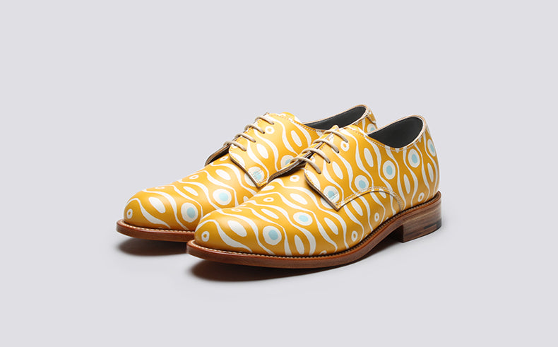 skinflint: Where does inspiration for the patterns come from?
JP: Everywhere.
CJ: There is a real magpie quality to our interests: we’re not pure in our influences! We look everywhere: Barron and Larcher, Bawden and Ravilious, Enid Marx, Omega workshop, Pennsylvania Dutch folk art, medieval embroidery, Laura Ashley, Curwen Press, quilts, Arts and Crafts, hand-lettering, Japanese paper.
skinflint: How important are trends to your work?
CJ: Not very important. Or not consciously. We make what we want to make, that feels fresh and interesting at that time – then sometimes we turn out to have struck a chord.
AM: We might include, say, some green patterns in our product photos, if ‘green’ seems all the rage. But we’re definitely not concerned with making fashionable designs. Really, the reverse is true; how wonderful to make a pattern that will be treasured in 50 years time.
skinflint: What do you think makes a classic, timeless pattern?
CJ: Simplicity, regularity without sacrificing liveliness, rhythm.
AM: I don’t think there are any rules - we’ve talked about making objects that pass the ‘skip test’; something that would be spotted in a skip and fished out as a thing of beauty in years to come. I think what characterises Cambridge Imprint's patterns is a simplicity and energy which comes from hand drawing our designs, and the restrictions of the printing process.
JP: A classic pattern has a certain balance between being pleasingly predictable to the eye whilst retaining the freshness of the slightly unexpected.
skinflint: Everything you design is produced in the U.K. Do you think that’s increasingly important to your customers?
CJ: Well, it’s increasingly important to us, and as we are our own ideal customers, perhaps the answer is yes. The imperative for us originally was that we needed to be able to oversee every small detail of the manufacturing and finishing of our products, and that’s obviously much easier if something is being made locally.
AM: For example, when the paper is printed, we can be on-hand to fine tune the colour of the inks as they are hand-mixed, so ensure we get a perfect match to our original screen prints.
CJ: And then as we gradually developed our network of small manufacturers in this country we found that in fact manufacturing here is carried out to an exceptionally high standard and it just becomes more and more interesting to look for ways to use that expertise creatively. For example there are a couple of bookbinders that we work with to make our notebooks and albums, and we have two different box makers who specialise in slightly different techniques. And they really are world class. By visiting and getting involved you understand more deeply what is involved in each process – what is possible, and how you might be able to use it. So often the constraints on a process are the fuel that drives invention.
Also, although our influences are eclectic, it has often been said that our patterns have a particularly English quality. So we like that it all hangs together nicely – the design and the manufacture all being authentically English. We are very pleased to have just received our first order from a shop in Kyoto, in Japan – the world capital of beautiful patterned paper. I think that’s an indication that we’re producing something with a very distinctive flavour.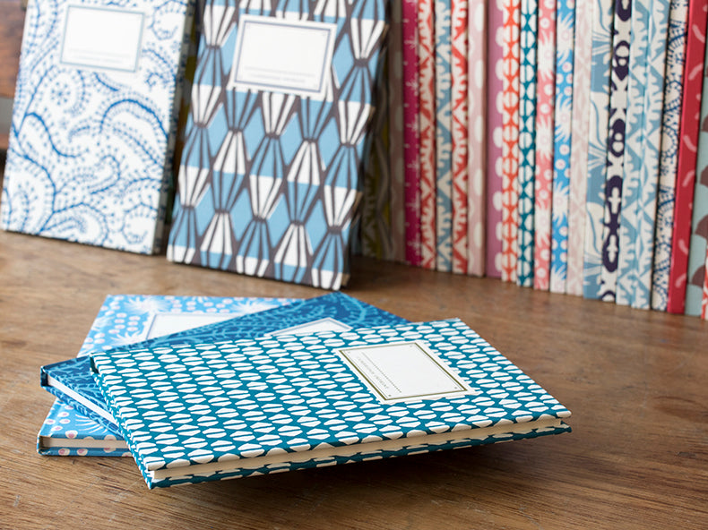 skinflint: Do you each have a favourite era when it comes to design and interiors?
CJ: The Kettle’s Yard house is probably my single favourite interior. It’s simple and pared back yet absolutely brimming with content at the same time. Everything in it is chosen and meant, and has equal significance, however grand or humble. I’m not sure where you would place it in terms of design era: early 20th century bohemian perhaps.
AM: Yes, when I was a teenager, I occasionally stopped off in Kettles Yard house on my way back from school. It was perfectly tranquil - white walls, old wooden floors and carefully placed pieces of art and natural objects. There again, I also love the decorative exuberance of Charleston. I suppose they share a domestic, very English aesthetic, which delights in objects with a simple, hand-crafted feel, rather than a sense of opulence or luxury.
JP: Kettles Yard again! The joy of objects placed with great sensitivity to the space they occupy and the light that falls on them. Such integrity to materials, peaceful and yet intensely exciting.
skinflint: Who do you each admire most in the world of design?
CJ: Carin Mansfield at Universal Utility: clothing without season, time, age or trend. Her finishing and eye for detail is exemplary and I love the braveness of her limited palette and the exuberance of some of the shapes.
AM: We all love Astier de Villatte’s press moulded ceramics; their pieces are very tactile and retain a sense of being made by hand.
skinflint: Do you have a favourite interiors possession?
CJ: A drawing of some fish lying on a plate by Jane Patterson. And I was recently given a very simple fluted Astier de Villatte bowl that I love.
AM: A small textile collage of a shoal of sardines made by Jane. The fish are lino printed onto scraps of hand dyed fabric and appliqued together.
CJ: There is a fish theme in fact…
JP: My favourite possessions are shallow porcelain dishes made by Ali and a little portrait that Claerwen painted of my youngest daughter. Other than that, a very simple calico hanging, lino-printed with Hungarian folk patterns in a lovely old red.
My skinflint picks: Please each choose three of your favourite skinflint lights from the current collection with a brief description on why you like them so much.
EASTERN BLOC FLUORESCENT (V4)
AM: I would choose 2 of the British lights from the 1950’s for their clean, simple lines; the white enamelled electrical substation pendants and the polished aluminium Benjamin pendants. I also like minimalism of the 1960‘s Eastern Bloc Fluorescent lights, which look like they are floating.
XL 1950S VINTAGE BENJAMIN PENDANTS
JP: There are some fantastic ones! My first choice would be the Czech prismatic pendants - decorative fluting on a glass globe but so simple. My second choice is the XL 1950s Vintage Benjamin pendant – it has a bold easy shape, and reflects the light pleasingly as well as giving it - I’d like one in my kitchen.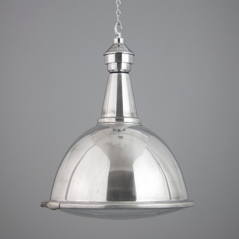
CJ: The Eastern Bloc factory lights with the black enamelled shades and polished aluminium galleries are beautiful. I would love to have a whole row of these above our workbenches in the studio. And all the 1950s British industrial pendant lighting, in particular the pale grey enamelled steel reflectors. The grey is perfect: not too warm, not too cold. Not too matte, not too shiny.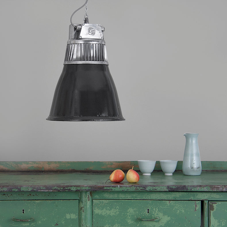
With thanks to Cambridge Imprint
You might also like
Bedroom Lighting Ideas
Our lighting experts offer advice on how to light a bedroom that’s truly suited to your needs, whether that’s for working from home, or relaxing and unwinding in.
Lighting advice
Make An Entrance with vintage lighting
First impressions always count and lighting design can make or break an interior. Make an Entrance with our new collection of vintage lights built to last.
Interiors| Lighting advice
In conversation with Nick & Stefan at Dodds & Shute
Ahead of The Retreat collection launch, we catch up with Nick and Stefan, the duo striving to bring sustainability to the forefront of the industry.


